The cornerstone of the Seton Hall identity is a set of primary logos that combine the Seton Hall symbol (the silhouette of Presidents Hall) with the logotype (the typeset name of the University).
The logo has three configurations: vertical, horizontal and centered, as shown below. The symbol should never appear by itself. In layouts, the preferred application is any of the three configurations, placed in a position of prominence.
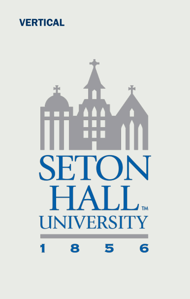


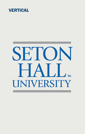
Our identity system also includes a set of three logotypes, shown below. These are intended for use in small or limited spaces. Note that it’s always preferable to use the primary logo instead of the logotype, and we should do so whenever possible.


Use of the Seton Hall athletics identity is restricted. Only the University’s intercollegiate athletic programs may use the athletic marks. Athletic marks may not be used in any form to represent any academic or administrative program. The Athletic marks are administered and managed by the Department of Athletics and Recreational Services and by the Pirate Blue Athletic Fund.
Usage
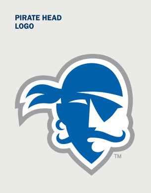
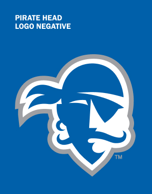
- The cornerstone of the Seton Hall athletics identity is the Pirate head logo. This is our primary and preferred athletic mark; it should be used on the majority of athletic communications and merchandise.
- The Pirate head logo should also be used on uniforms, practice gear and apparel, whenever applicable.
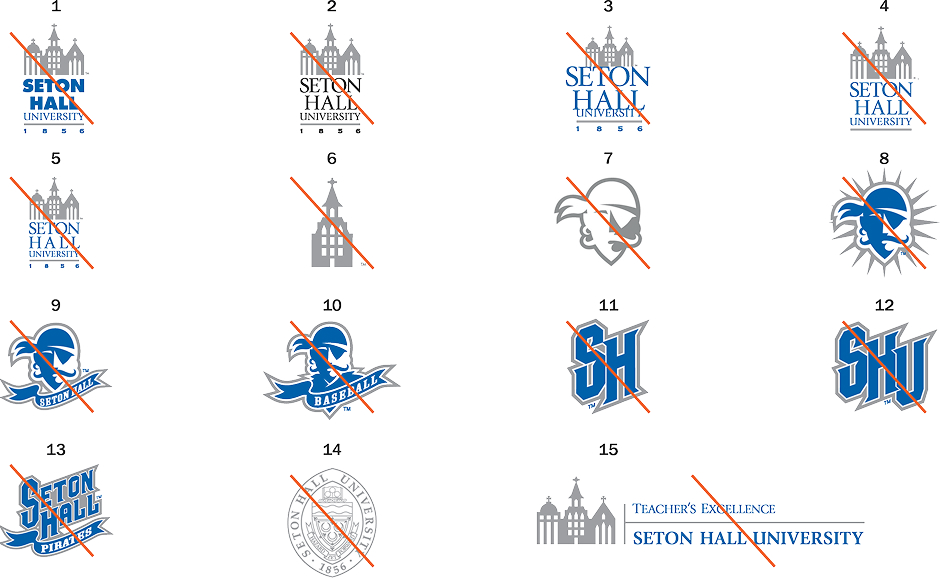
Noncompliant Applications
Notes
- Don't change the typefaces in the primary logo.
- Don't use unapproved color combinations.
- Don't resize the elements of the logo.
- Don't use primary logo without the date.
- Don't realign or justify the type in the logo.
- Don't redraw parts of any University marks.
- Don't reverse the Pirate mark.
- Don't add shapes to the Pirate mark.
- Don't use the Pirate logo with the Seton Hall
ribbon underneath. - Don't use an unapproved name or tagline with the Pirate logo.
- Don't use the athletics monogram outside of headwear.
- Don't use the athletics monogram with the letter "U".
- Don't use the old athletics logotype.
- Don't use the seal without approval.
- Don't use an unapproved name with the logo.
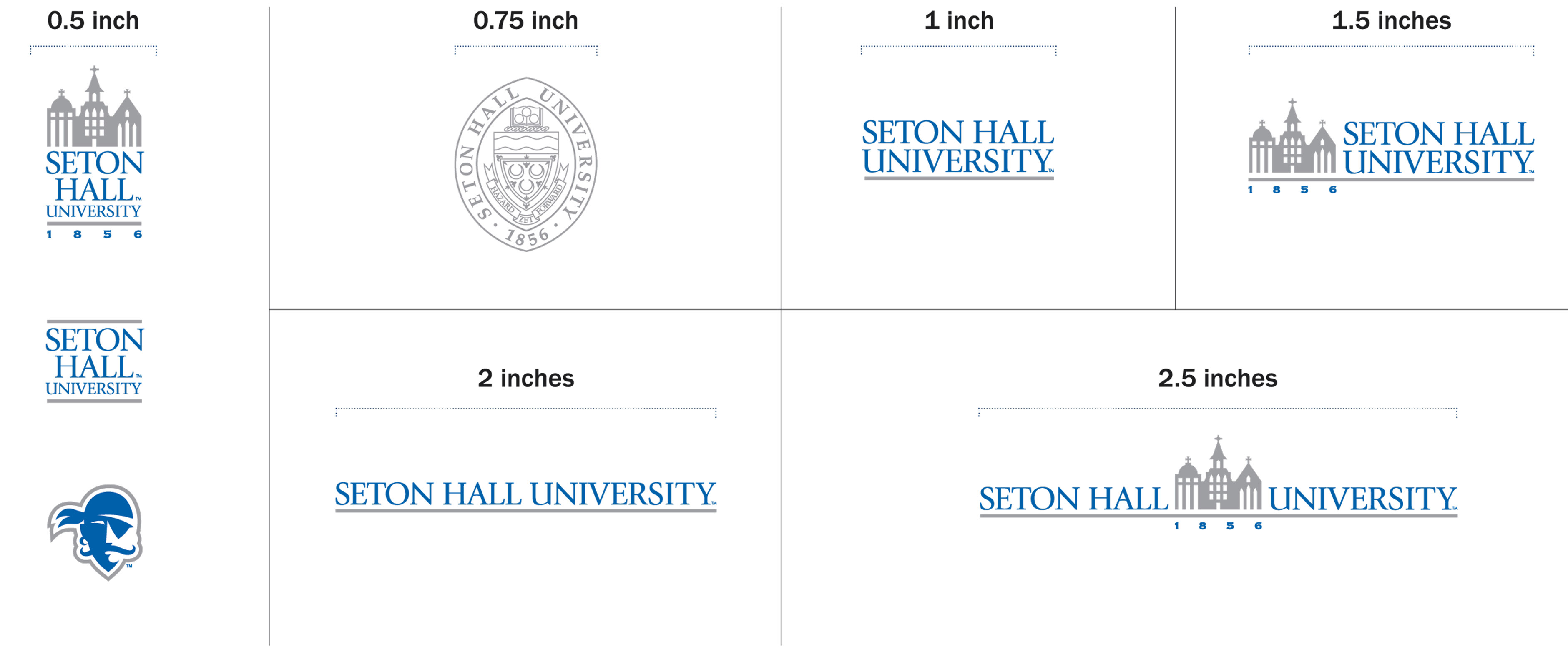
Minimum Sizes
Notes
- Each of the Seton Hall logos has a minimum allowable size. To ensure clear reproduction and legibility, the marks may not be used at sizes any smaller than the widths shown on this page.
- These logos are not to shown to scale. Use the specified width dimension as your guide.
Logo Clear Zones
Notes
- Each of the University’s primary and secondary logos have an established clear zone. This clear zone is intended to maintain the logo’s integrity and to avoid visual confusion.
- No other type or graphic element (including folds, trims or edges) should fall within the clear zones, as shown here.
- The clear zone for each of the University primary and secondary logos are 1½ times the height of the letter "S" in each mark (A).
- For the formal marks, this clear zone is based on the height of the bar in the top of the crest (B).
- The Seton Hall athletic marks have an established clear zone. This clear zone is intended to maintain the logo's integrity and to avoid visual confusion (C).
- For the Pirate head logo, the clear zone is the same as the height of the Pirate's bandana.
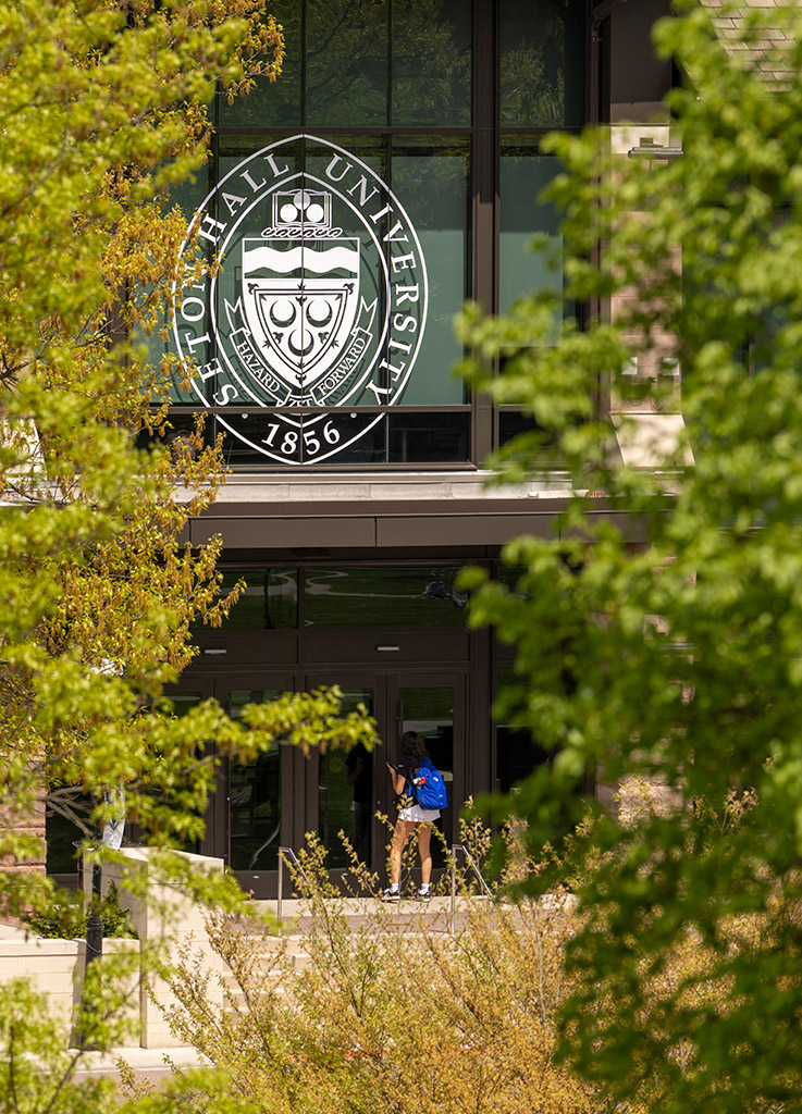
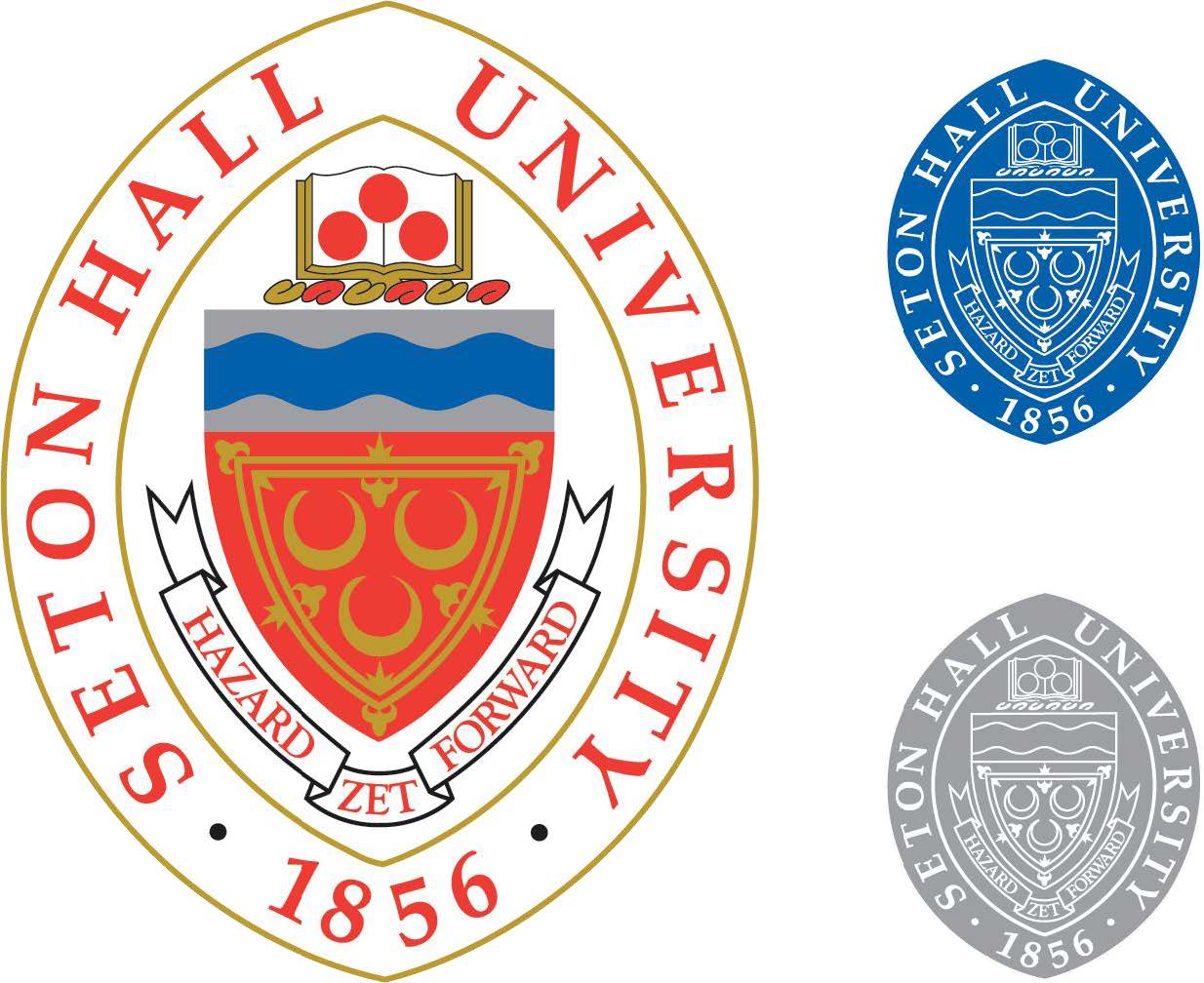
Crest and Seal
The Seton Hall University formal marks are the historical crest and the official seal. They are to be used for formal publications only. These publications include, but are not limited to, the following: materials related to official University events such as Commencement Exercises, Faculty Convocation and Charter Day; print materials issued from the Office of the President, the Office of Mission and Ministry, or the University's Board of Regents and Trustees; and select print materials.
Usage of these marks require the permission of the Division of University Relations.
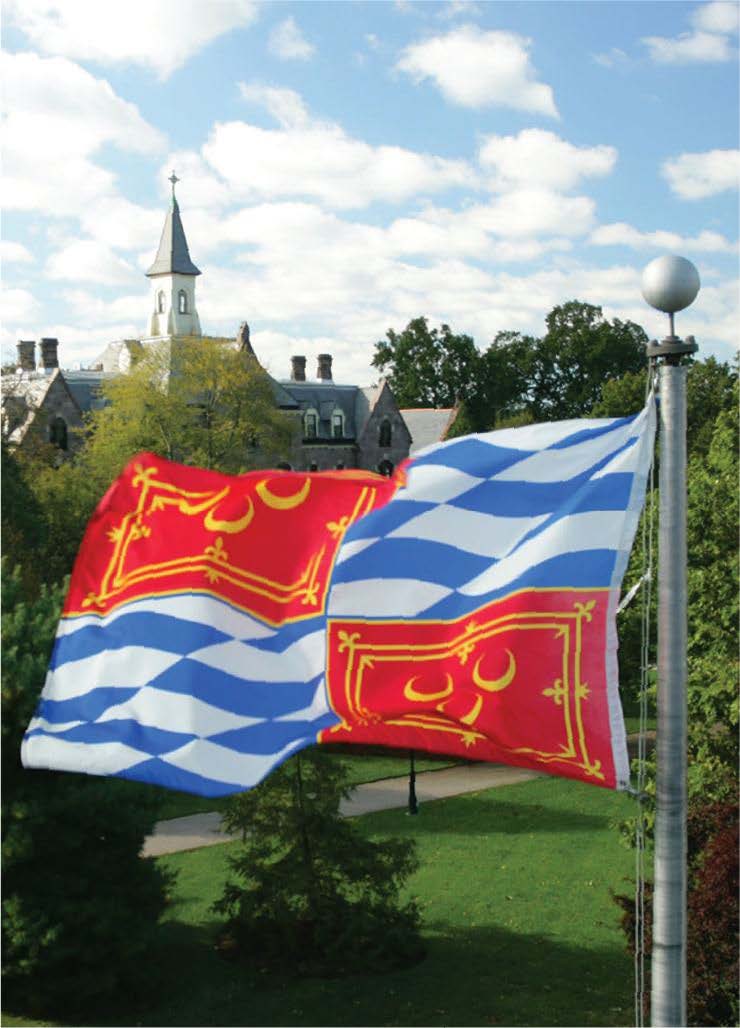
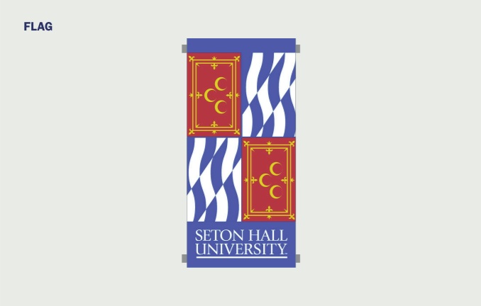
Flag
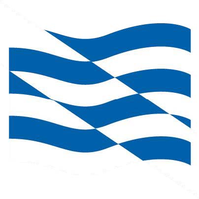
The Seton Hall University flag was unveiled on February 25, 2005. The quartered flag (below left) represents the coat of arms of the Seton family and that of the Archdiocese of Newark. When combined, they form the University s coat of arms. The three crescents on the Seton coat of arms represent three Scottish coastal villages the sea towns, a possible origin of the Seton family name. The royal family of Scotland later honored the Setons by adding the design that borders the crescents a royal tressure enriched with fleurs de lis. The blue and silver waves, taken from the Archdiocese’s coat of arms, represent the rivers of New Jersey. Silver becomes white on a flag, and thus blue and white also represent the University’s colors on the flag.
Typography
Typography is a robust vehicle for our brand voice. It contributes significantly to how readers receive and feel about what we say. Our communications use two typefaces that work together to bring our story to life. They each have their own strengths, so use this section to guide your typographic choices.

fonts.adobe.com
All typeface families are available for activation via subscription to Adobe Creative Cloud. You can activate fonts from the link above on the Adobe Fonts page.
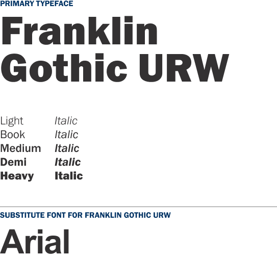
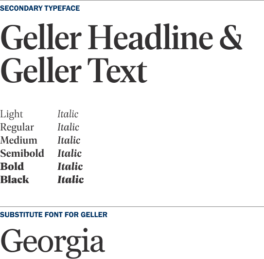
Franklin Gothic URW is our primary typeface: a sans serif family that is a workhorse for our brand. It performs well at all sizes, so we use it for headlines, subheads, callouts and body copy.
Geller, our serif family, is our secondary typeface. We use it in more sophisticated applications, as a complement to Franklin Gothic URW. Its elegant letterforms give our communications grace and personality. We choose it most often for subheads and body copy. Used together, these typefaces help create clear hierarchy within layouts and keep our content legible and engaging.
Color Inspiration
Much of our color palette is inspired by the art and architecture seen around the University. It is a subtle way to honor our legacy while creating a sense of familiarity.
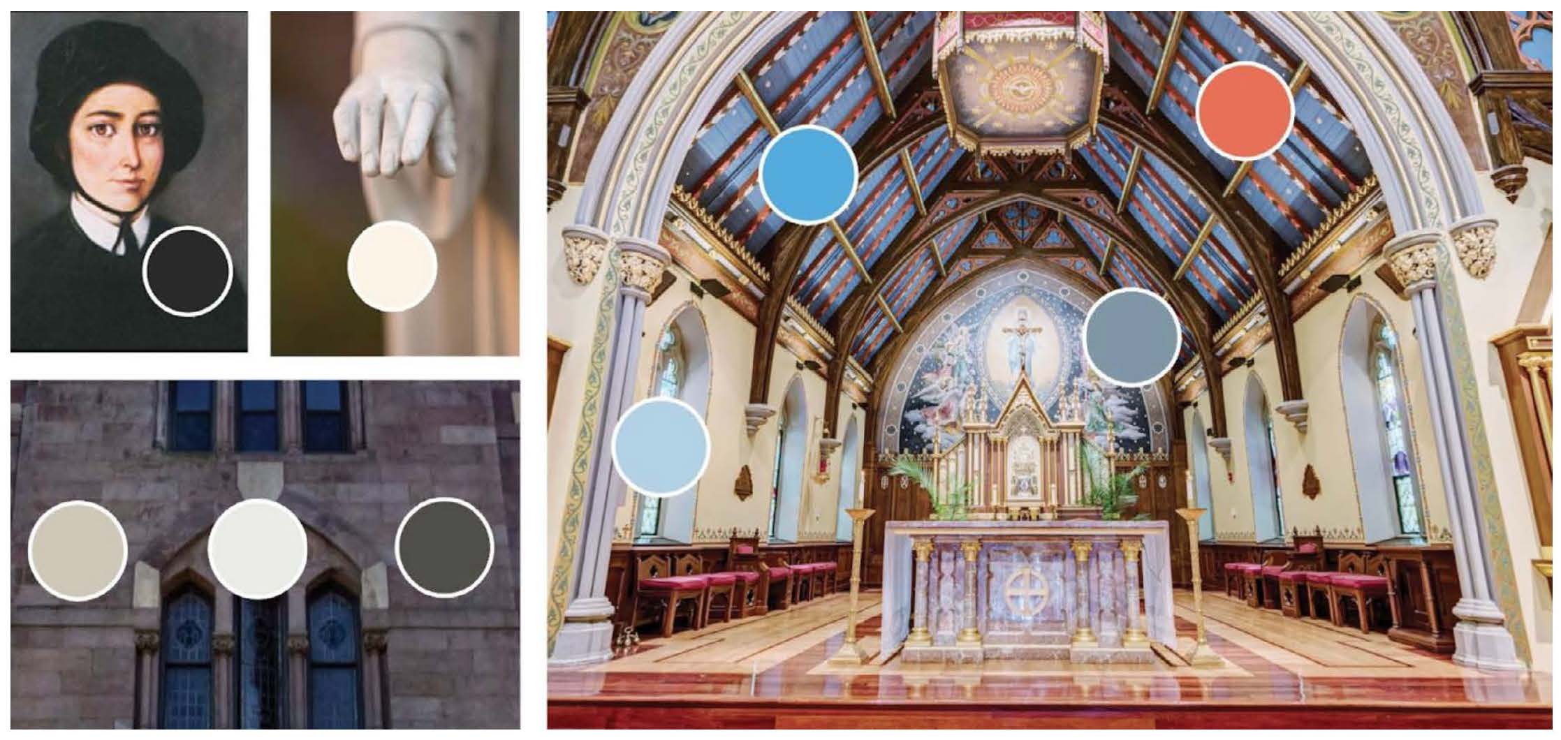
Color Palette
Beyond our logo, color is the most recognizable aspect of the brand: it can help audiences identify us at a glance. The way we use color sets the mood for each of our pieces, and reflects our heritage. Using color is an easy way to evoke energy and emotion in our communications.
Primary Palette
Our primary palette consists of Seton Hall Blue and Seton Hall Navy. Our layouts lean heavily on these colors, mixing in selections from the other palettes to build color schemes that are complementary and balanced.
PMS: 286
CMYK: 100, 60, 0, 6
RGB: 0, 96, 169 HEX: #0060A9
SETON HALL BLUE
PMS: 281
CMYK: 100, 60, 0, 56
RGB: 0, 50, 99 HEX: #003263
SETON HALL NAVY
Accent Palette
Our accent palette includes cyan, orange and metallic silver. These colors are essential for building layered communications, making longer pieces easier to navigate, and otherwise adding depth to a visual expanses that are predominantly blue.
PMS: 2170 CP
CMYK: 63, 18, 0, 0
RGB: 81, 170, 223 HEX: #51AADF
CYAN
PMS: 1655 CP
CMYK: 0, 79, 100, 0
RGB: 241, 93, 34 HEX: #F15D22
ORANGE
PMS: 877 C
CMYK: 48, 38, 37, 2
RGB: 141, 144, 147 HEX: #8D9093
METALLIC SILVER
Neutral Palette
To meet the full range of our visual needs, the brand also offers a variety of neutrals that can function as backdrops in layouts and add balance to the overall palette.
Black
PMS: BLACK 6 C, 95%
CMYK: 0, 0, 0, 95
RGB: 51, 49, 50
HEX: #333132
Dark Gray
PMS: 2616 CP
CMYK: 63, 57, 60, 37
RGB: 81, 79, 75
HEX: #514F4B
Slate Blue
PMS: 6219 CP
CMYK: 54, 33, 28, 1
RGB: 126, 150, 164
HEX: #7E96A4
MEDIUM GRAY
PMS: 422 C
CMYK: 3, 2, 0, 37
RGB: 157, 159, 162
HEX: #9D9FA2
TAN
PMS: 4240 CP
CMYK: 20, 17, 27, 0
RGB: 205, 199, 183
HEX: #CDC7B7
Sky Blue
PMS: 5445 CP
CMYK: 28, 9, 3, 0
RGB: 180, 209, 230
HEX: #B4D1E6
White
PMS: 000C WHITE
CMYK: 0, 0, 0, 0
RGB: 255, 255, 255
HEX: #FFFFFF
Light Gray
PMS: COOL GRAY 1 C
CMYK: 7, 4, 8, 0
RGB: 234, 235, 230
HEX: #EAEBE6
Cream
PMS: 663 C
CMYK: 1, 3, 9, 0
RGB: 251, 243, 230
HEX: #FBF3E6
Seton Hall University is committed to ensuring equal access to all digital content, programs, and services. Our web and online materials are developed in alignment with the Web Content Accessibility Guidelines (WCAG) 2.0 AA, as defined by the W3C Web Accessibility Initiative. This commitment helps guarantee that all users, including individuals with disabilities, can fully engage with the University's digital environment.
Photography
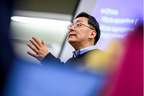
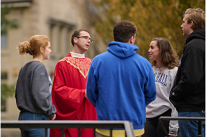
Photography plays a significant role in our visual language. Nearly all of the images we use fall into one of four categories proud Pirates, the academic collective, our campus environment and our engaged community which we detail on the following pages. As you compose communications, draw images from multiple categories to create balanced compositions that represent the full Seton Hall experience.
On this page, we've identified a few technical considerations for choosing and capturing images that reflect our brand strategy and complement our visual language.
Subtle Hints of Blue
We often incorporate hints of Seton Hall Blue in our images as an additional visual nod to the brand. This can be achieved through background choices, wardrobe direction or subtle inclusion of props. (However, we don't retouch photos to add blue after the fact.) Repeated touches of blue help our images feel united across different layouts and communications.
Candid Authenticity
As we shoot new images and evaluate existing ones, it's important to remember that they should always feel real, never posed or staged. Capture environments as they are, with the work at hand in all of its messiness and complexity. Resilience resonates through process, and it's okay to show that.
Obstructed Foreground
One photographic technique that we sometimes use involves either composing or obstructing the foreground of the photo. This moves the viewer's eye to the moment at hand, and adds a sense of dynamic focus to the image and composition.
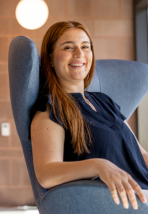
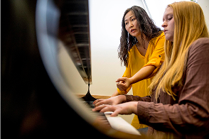
Proud Pirates
The photos in this category depict our students, faculty and alumni. They're looking directly at the camera, within an environment that matches their area of profession or expertise. Whether it's in a gallery or a hospital, at a start up or the United Nations, Pirates are always present. Let's show that to our audiences.

Academic collective
For this category, we document academic moments in ways that are true to Seton Hall: showcasing the fortitude it takes to get the work done, and balancing that with the compassion and humanity that characterize our community. These photos should depict both groups and individuals, and should include moments of focus, reflection and levity - all of which are needed to push the work forward and succeed.
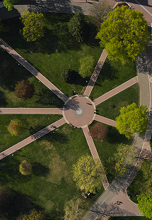
Campus Environment
Our campus is stunning not just in its postcard perfect views, but also in its many smaller details. To that end, we want to expand the sense of place imagery beyond the usual and expected shots, balancing macro and micro moments more intentionally. Doing so paints a more complete picture of the multifaceted environment where we study and learn and work and play.
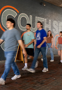
Engaged Community
Our students and our broader community have myriad options for spending their time outside the classroom. In this category, we look to capture the full range of campus life. This includes active shots from big games, club meetings and other events, as well as photos that depict everyday life, from the high energy to the reflective. Be sure to include both individuals and groups as subjects.
AI and Photography
Seton Hall University supports the responsible and ethical use of generative AI tools,
with a strong emphasis on upholding academic integrity, safeguarding data and respecting
intellectual property rights.
In alignment with these values, the University prohibits the use of AI to generate
entirely new photographic or photorealistic images - particularly those featuring
human subjects or identifiable University content for use in University communications.
Generative AI may be used to edit or enhance existing, authentic images, but it should not be employed to fabricate original photographic content. These guidelines ensure that visual materials remain credible and maintain the integrity of Seton Hall's communications and public representation.
Graphic Elements
While typography and photography tend to take the lead in our graphic language, the elements in this section expand the brand's toolkit. Used carefully, these techniques contribute to designs that feel more dynamic and have clear visual hierarchy.
Marinière Pattern
Textures
Badges
Anchors and Icons
Building Blocks
Marinière Pattern
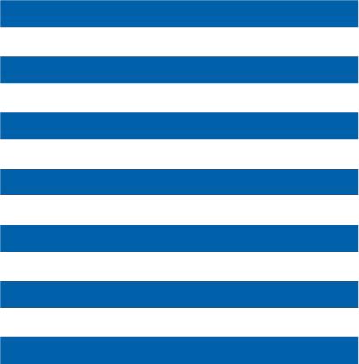
This horizontal pattern of blue and white stripes, based on a classic uniform of the French Navy, is an energetic and versatile element that has many useful variations. Its wavy iterations recall similar panels on Seton’s Hall flag, which represent New Jersey’s rivers. The pattern’s rhythm also visually demonstrates the persistence and purpose that characterizes our community.
In layouts, the marinière pattern can anchor smaller elements, flood full spreads, or help organize content. Its applications should always feel spirited and fresh, never corporate. It’s acceptable to play with the spacing of the lines and adjust their orientation, to interact with other compositional elements in dynamic ways.


Textures
We often choose these textures to accent components such as type and images. They can also serve as subtle backgrounds, grounding compositions with an expressive and tactile aesthetic.
Concrete
Chalk
Burnish
Swirl
Light
Type Badges
This graphic tool taps the breadth within the brand’s typography to create interesting type driven badges, which are great for accenting and embellishing layouts. As shown below, text can be paired with anchoring icons or marinière stripes. In general, these badges highlight important phrases, authentic sentiments or noteworthy dates for the institution.
Anchors and Icons
Our collection of icons was inspired by the details and patterns of stained glass windows on campus. We often incorporate icons to anchor captions, type or photos, or to add a subtle and dynamic layer in the background of compositions. They should not be used like logos; rather, they act as a more graphic version of textures.
Building Blocks
Our rich and vibrant community is steeped in Catholic values, which serve as the building blocks to the Seton Hall experience. These graphic blocks represent those diverse yet universal perspectives. This graphic tool can be used in ways that feel more spirited or more reserved, as shown below. Fill them with key phrases, value words, navigational details and more.